Cybersecurity
Login & OTP App UI Redesign
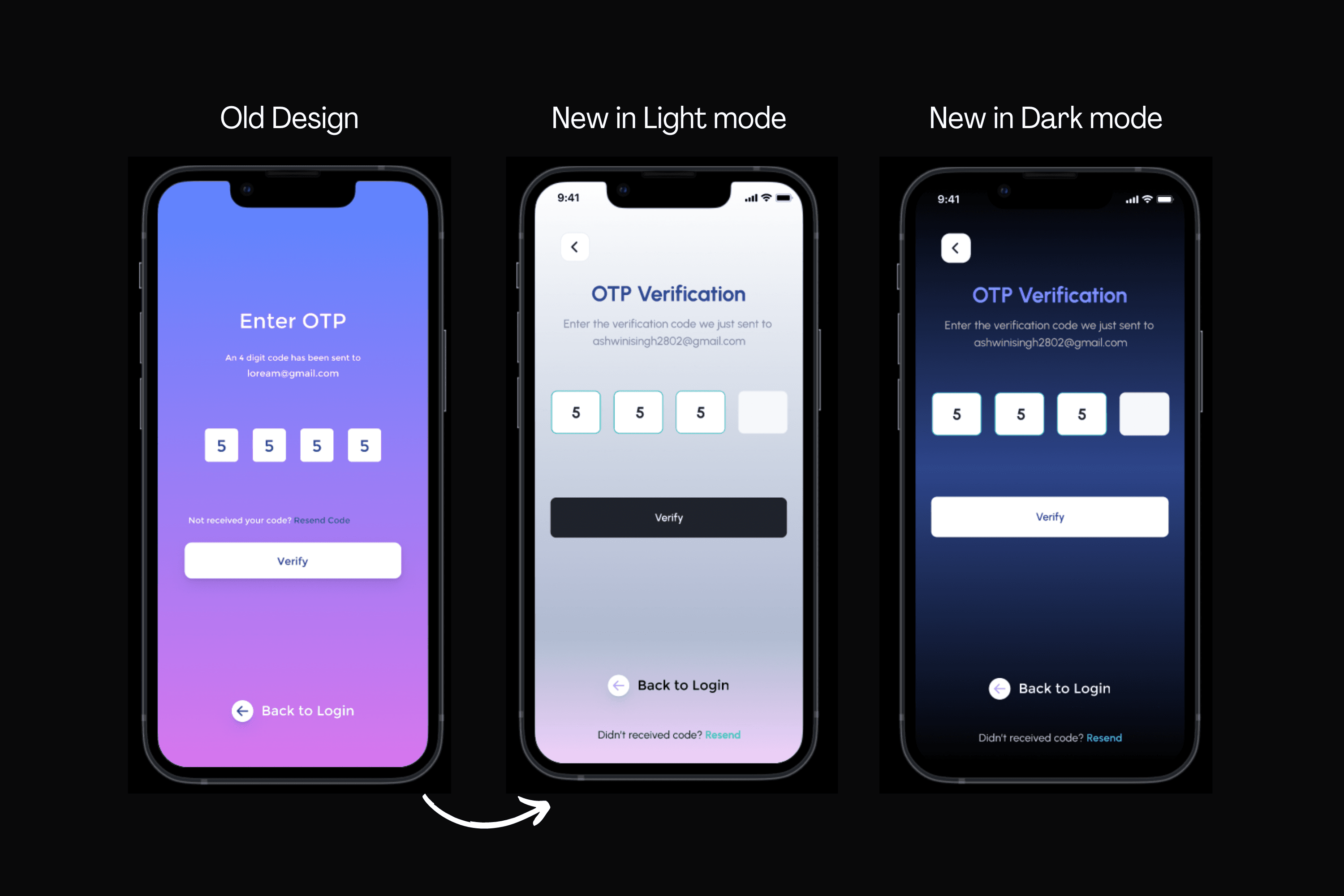
With user-centered approach, the goals was to redesign the login & OTP verification app interface for better user experience..


Challenge
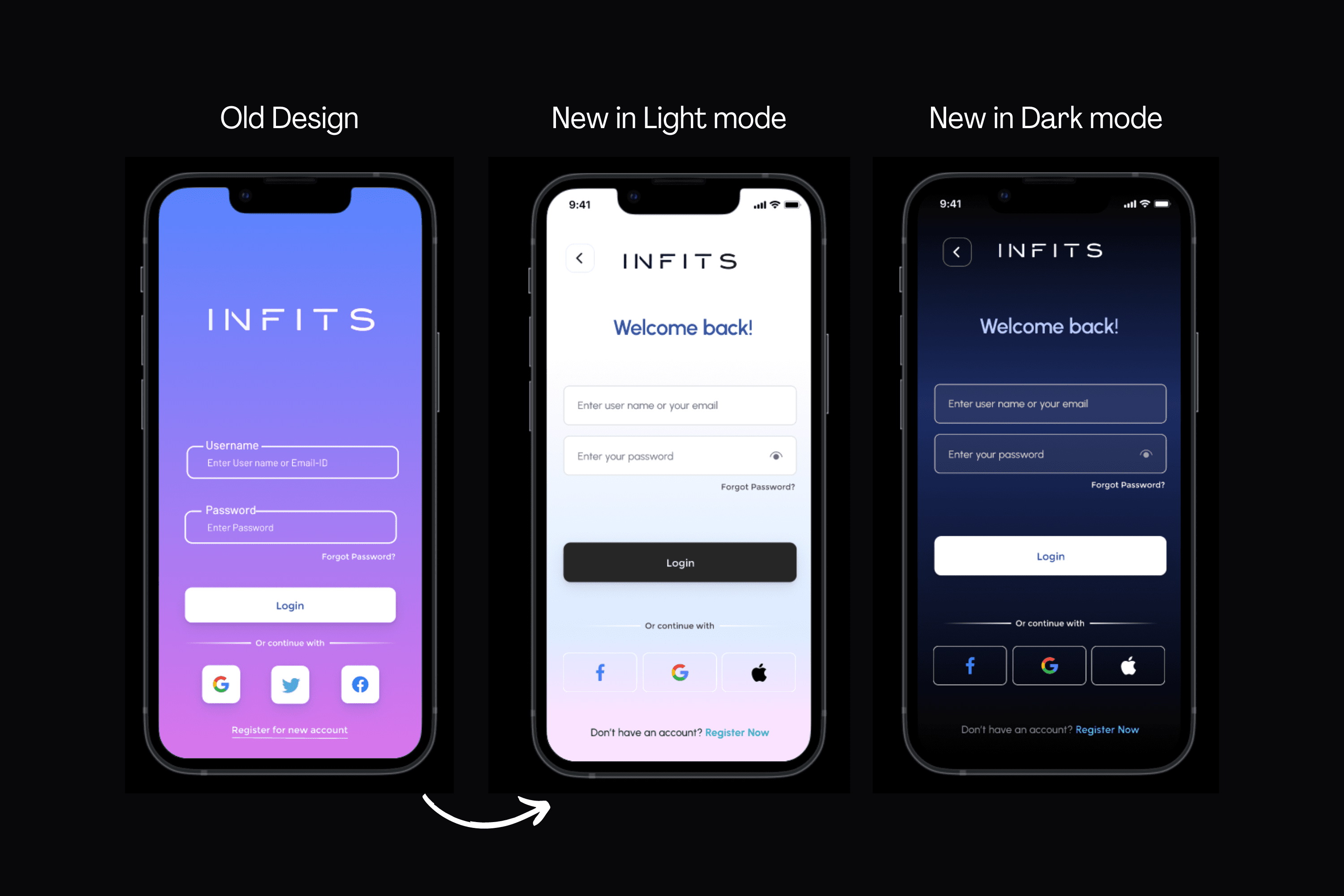
The app had a cluttered interface, making it slower for users to login and verify using OTP. The goal was to create a modern UI with better UX.
Changes made by me and why?
"Welcome Back!" Message:
Provides a friendly and personalized touch, making users feel acknowledged and appreciated.
New User Name Input Box:
Enhances user interaction by offering a dedicated space for entering the username, improving clarity and ease of use.
Password Input Box with Hidden Icon:
Prioritizes security and user confidence by implementing a hidden icon for the password input, giving users control over the visibility of sensitive information.
Reduced Background Color:
Acknowledges the importance of a minimalistic and less distracting color scheme during the login process, contributing to a cleaner and more focused interface.
Changed Login Box Color to Dark Gray:
Utilizes a dark gray color for the login box, potentially reducing eye strain and providing a visually appealing contrast that enhances readability.
Removed Twitter, Added Apple Login Option:
Tailors login options to user preferences by removing Twitter (if it wasn't widely used) and introducing the Apple login option, catering to a broader user base.
Added Registration Recommendation:
Encourages user engagement by suggesting the registration option at the bottom, providing a seamless transition for users who might be considering creating an account.
Results
The redesigned app features a clean, clutter-free interface, making it easier for users to login faster. Some of the main points are:
Enhanced User Engagement
Improved Clarity in User Input
Increased Security and User Confidence
Streamlined Aesthetics with Reduced Color Palette
Alignment with Modern Design Trends
Encouraged User Registration
Expanded User Base with Apple Login
Potential Reduction in Eye Strain: The dark gray login box color and reduced background color may contribute to a reduction in eye strain, particularly during extended usage, improving the overall usability and accessibility of the app.
76%
25%
84%
Open Figma File
While most of my client reviews are NDA-protected (because, you know, top-secret agency white label stuff), I managed to sneak in a few favorites from my previous partners.